
Creating an illustration system
When I joined Tyler Tech in 2018, I was excited to sink my teeth into some pretty complex software applications. The first product I was assigned to work on was a Student Information System, or school portal. I thought, “Perfect! Not only is this subject matter in my wheelhouse, but this is an app that can have some personality!”
As I moved through the design process, I dug into the archives of work created by my teammates — I was ready to add that personality to my prototype, so I was specifically on the hunt for illustrations. I was shocked to find only a handful of designs actually incorporated illustrations, and a bit confused because I couldn’t find a thread of consistency between the styles being implemented. This discovery presented a problem — our products didn’t look unified under one brand.
Samples of illustration styles found at Tyler Tech

I decided to do some research and talked to the designers who had used these graphics. I learned some had drawn their own illustrations and some had pulled free stock illustrations they found online. I spoke with software engineers who told me they just blew up icons to large sizes if a graphical treatment was needed. I even spoke with the Director of UX, and one thing became clear: no one had ever thought about the value illustrations could add to our products.
This was a problem I could solve — I could create an illustration system that would become a key component to our brand identity.
And so I did.
New single color spot illustrations

Laying the foundation
Since no one had ever created an illustration system before, I had total cart blanche. With no guardrails in place, this project had the potential to creatively spiral out of control. So I took a step back and identified framework to guide my creative process:
Be intentional
Illustrations should be used to educate, provide context, convey complex ideas, drive engagement and guide our users through pivotal points in their journey.
Be approachable
The illustrations should communicate Tyler’s personality by creating moments of delight that feel authentic, warm, inviting, and relatable. The style should balance playfulness with professionalism, and create an inclusive representation of the Tyler community.
Be scalable
Tyler has hundreds of products shipped to a multitude of platforms and devices. The illustration library should be built in a way that allows its parts to be repeatable across all platforms and use cases. Think of it as part of a system that can be seamlessly plugged in to any application.
Be long-lasting
The illustrative style must have longevity. Because Tyler Tech is such a massive company, change is a long, slow and daunting process. There are many layers involved in major change, and hundreds of products that are impacted. As such, the style should avoid being too abstract or trendy.
Building the style
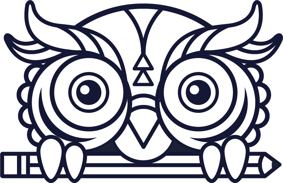
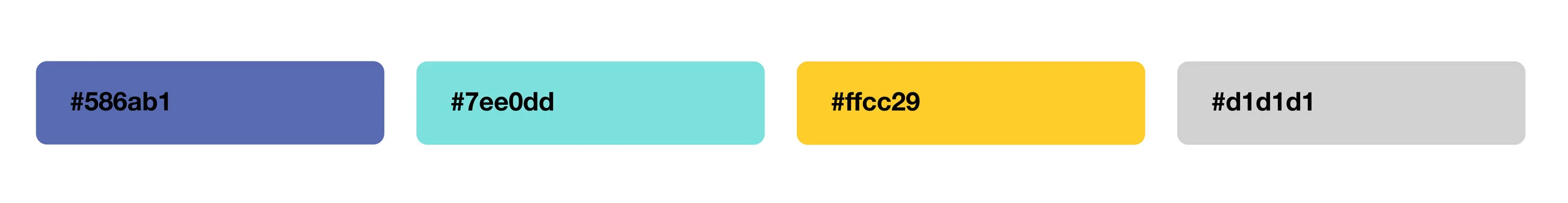
The indigo, amber and grey palette pre-dated my time at Tyler, and one restriction I was given was to stick within that palette. The only change I could affect was the addition of a fresh teal color. The corporate brand colors are deep blue and green, so the teal felt like a nice nod to that palette.
Full color spot illustrations

I also wanted to utilize a style that felt cohesive with our evolving design system, which was in its infancy at the time. Because the design system was in the process of being built out, I didn’t have much to go on other than a few solidified components. Other than color, the only other visual distinguishers I could build upon were the rounded edges of the cards, hover states, buttons, selection controls, etc. and the flat, outlined style. I could work with that.

In the end, the style evolved to something lightweight and conventional that could scale across multiple platforms and devices at many different sizes.
Once the style had been solidified, I began working on the comprehensive system. Creating a suite of error messages was big on my list of to-dos, and as I explored the existing error messages, I found them to be sterile, overly technical and often cryptic. One of my fellow teammates had a background in content writing, so I asked if she would be interested in partnering to create some truly fantastic error messages and empty states. Thank goodness she said YES, because her copywriting brought a whole new element of magic that complemented the illustrations.
Error message illustrations + copy

Looks like you’re off the grid.
Check your internet connection and refresh the page.

Houston, we have a problem.
Something got tangled up on our end. Contact your system admin for help.

Oops, you’re out of time.
The create password link expired or has already been used.

Vintage is cool, but it’s time for an upgrade.
Install the newest version of your browser to access this app.

We’re cleaning up a few things!
Thanks for your patience as we perform some routine maintenance.

Well, this is awkward.
The file size is too large and cannot be uploaded. Please reduce the size of the file and try again.
“Obviously it sucks whenever you get an error message, but it sucks less when you get a chuckle out of it. Of course not everyone will get the jokes, but for those who do, it proves the program designers aren’t all humorless robots.”
Empty state illustrations


We’re REAL humans making products for other REAL humans.

WIP: Illustrative representation of our users
One of the biggest factors missing from our products was the human element. Tyler’s mission is to “Empower the people who serve the public,” yet there was nothing in our applications that visually represented our diverse community of users. Moving forward, I would love to explore ways to portray our users within our product experience and add yet another layer of personal connection—I am only just scratching the surface of giving our brand a face.
Lessons learned
It’s challenging to build an illustration system from scratch when you are a team of one.
When I began this project, I was a bit surprised to learn I was the only person in a company of 8,000+ people that had any traditional design or illustration experience. I was thrilled at the opportunity to create this system, but it became challenging when I had to split my time between this project and my other UX/UI projects. My UX design work had to take precedent, and I wasn’t able to give the illustration system the attention it deserved.
Additionally, I became an illustration factory. Once I presented this system at a company-wide conference, the requests came in fast and furious. There were moments where I felt completely overwhelmed as I tried to keep up with the demand. As a result, some of my concepts fell a little flat for me. Looking back, I would have rethought the rollout and request process.
Working in a vacuum
And another surprising element - I really didn’t have anyone to use as a sounding board, which is a detriment to the design process. It felt like I was working in a vacuum. Even the Director of UX told me, “I trust your instincts. This is your area of expertise, not mine. I think everything you draw looks fantastic!” Though I am proud of the system I’ve built to-date, I know it could have an even stronger system had I been challenged and pushed.
Lack of diverse perspective
Representation is complicated. When I created this system, I drew upon my own life experiences… which is at least a start. But since one of the major goals is to represent our diverse community of users, I feel like I fell short. Given my other job responsibilities, I wasn’t able to do a deep dive in terms of research. I wish I had been able to talk to more of our employees as well as some of our clients. I’m hoping I’ll be able to do so in the next phase of evolving system.
Looking forward
Version 2.0
The Tyler Illustration System has been living and breathing for a year, and I’ve learned so much about both the successes and shortcomings of the system. I’ve already identified a list of items that need to be addressed in the next iteration:
Guidance
The illustration usage documentation I created (now being consumed by software engineers and designers) is not nearly prescriptive enough. The lack of thorough documentation left some grey area and has ultimately led to inconsistencies. I’m already working on buttoning-up this documentation.Theming
In the initial pass of the illustration system, I did not take Dark Mode nor the idea of “theming” into consideration. I only recently learned that some client sites are able to customize their Tyler experience with their own brand colors, so I’m now working with our software engineers and front end devs to figure out how I can best deliver the illustration files in a way that allows for customization.Color
The use of amber has since been deprecated globally, which opens up the potential to adjust the color palette. I’d love to do a deep dive into color theory and work with some of the key stakeholders to update and modernize the palette.Strategy
As previously mentioned, large changes are challenging to execute on at Tyler Tech. Conversations with the Design System Governance Board have already begun as to how we deliver this next iteration. Currently our library is hosted via a CDN, but the board is already planning to move away from that and instead deliver “packages” to the product dev teams. The illustration library would be part of that new package.Brand identity
I’ve also thought about ways in which I can pay subtle homage our corporate brand (a logo mark comprised of dots) and may introduce a halftone pattern into the mix. The introduction of a pattern would also bring a unique element to the system as well and will make if feel a bit less ordinary.Support
As I mentioned, it was challenging to work in a silo. Moving forward, I hope to assemble a core team and generate fresh ideas, participate in creative reviews, and push the boundaries of this illustration system and my own creative capabilities.
Reflect diversity
I’m still learning how to represent people in our products. I know my perspective does not represent the global Tyler community, so I’m in the process of pulling together a diverse group of employees to use as a resource and a sounding board. I’m excited to learn more about the life experiences of others and to hear thoughts on representation. I know the conversations will be eye-opening and educational, and will continue to push my own views and creative decisions in a positive direction.