

04
AI/ML Image Series
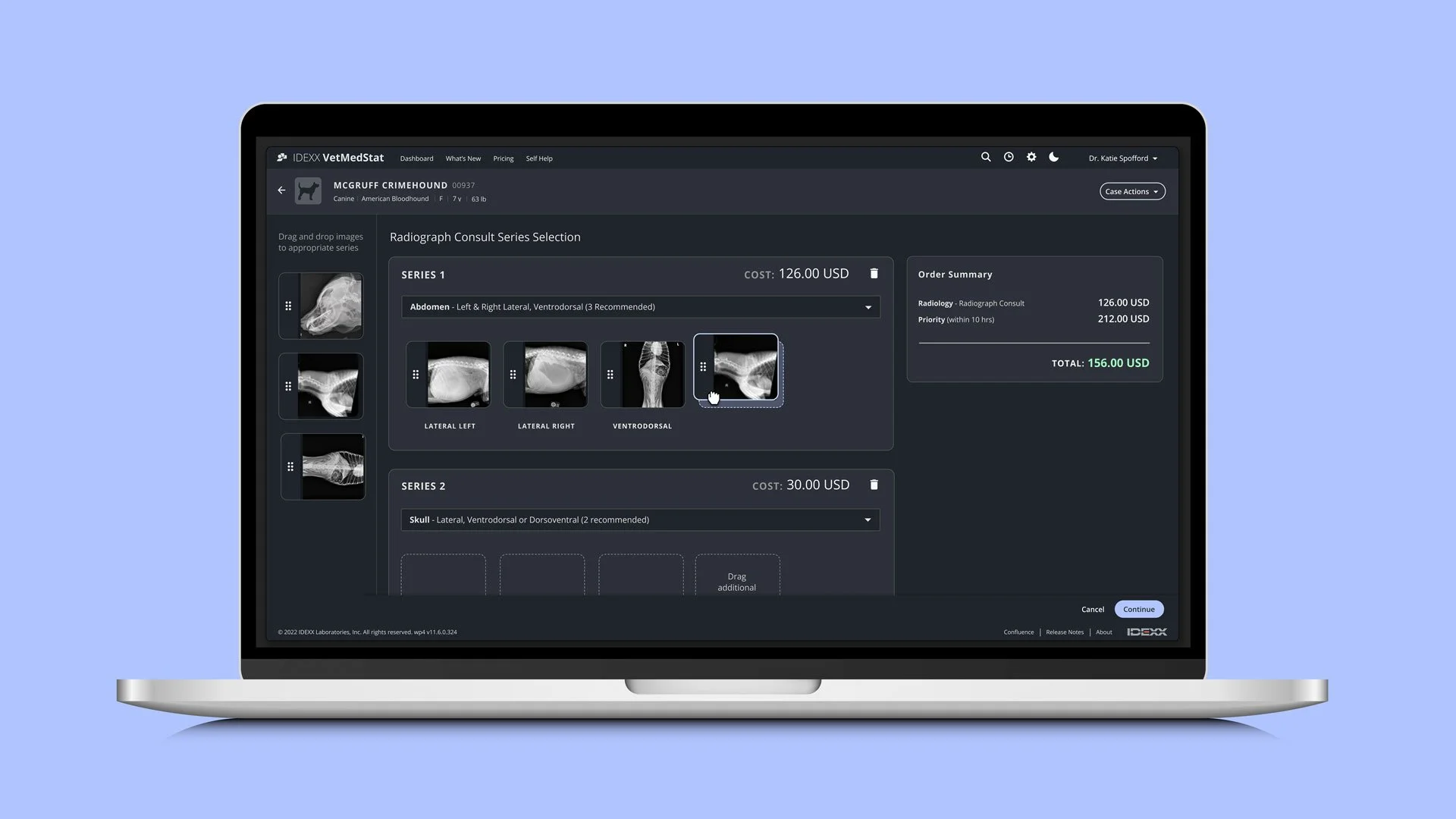
Overview
The Series Selection page utilizes AI/ML to automatically categorize radiographic images into the correct anatomical series. However, due to image quality issues—such as human body parts in the frame, improper positioning, or full-body captures—the auto-categorization often falls short, requiring users to manually sort images.
Through session recordings and user interviews with veterinarians and vet techs, we uncovered significant usability issues. The interface lacked responsiveness, error messages were confusing, and the manual sorting process was frustrating. These challenges led to excessive time spent, frequent error clicks, and abandoned sessions, making this screen a major blocker in the workflow.
My Role
UX/UI Design
Prototyping
Illustration
Challenge
Redesign the interface and interactions to improve clarity and responsiveness, thereby reducing user confusion, backtracking, frustration, and session abandonment.
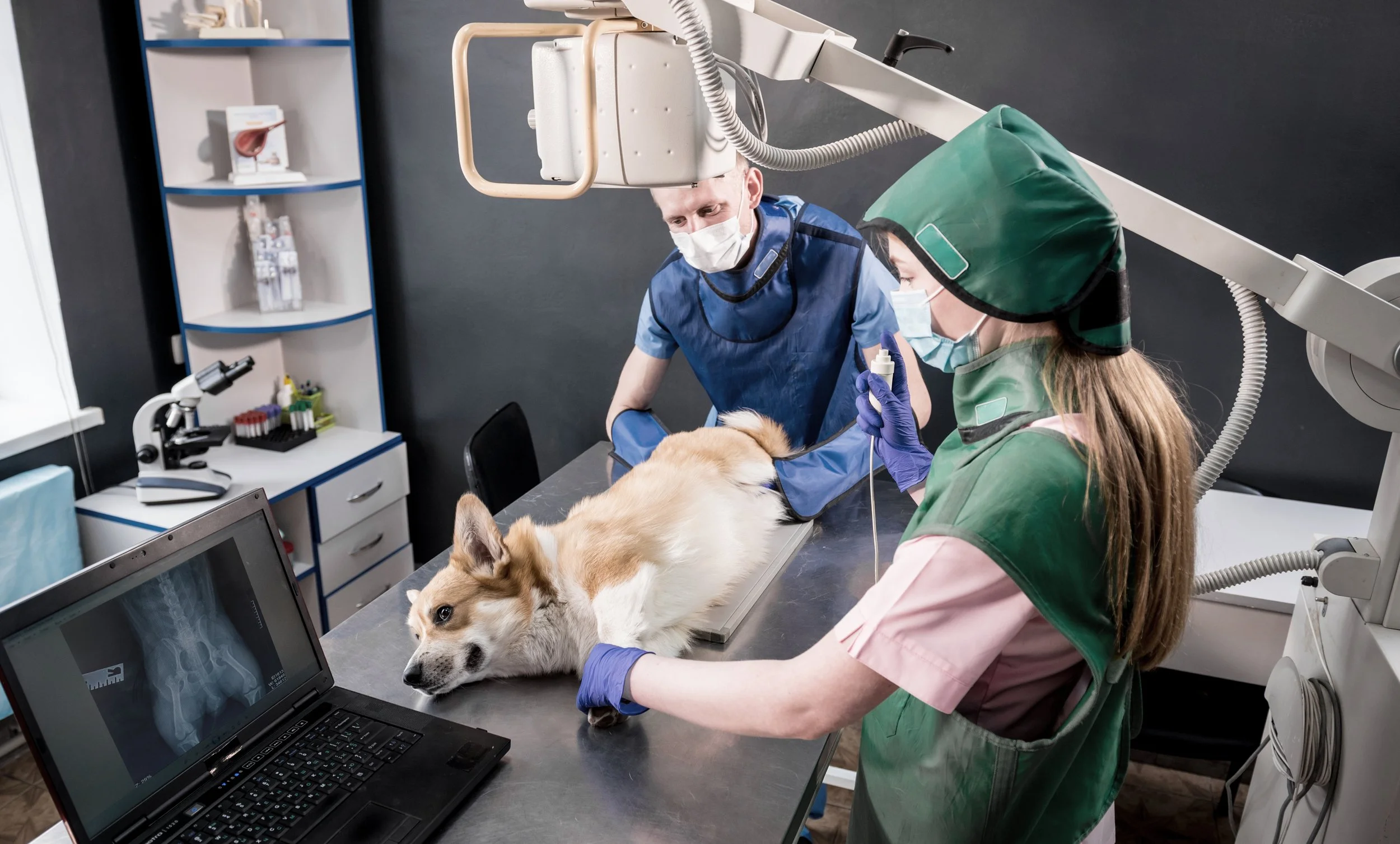
Veterinarian and Technician capturing radiographs (lateral positioning), which are then sent to VetMedStat
The Problem
The current interface lacked clarity and responsiveness, leading to user confusion and frustration. Users struggled with icon placement, lack of visual feedback, and obstructive error messages, which ultimately led to a high rate of rage clicks, backtracking, and abandoned sessions.
Research + User Insights
Through user session recordings, error tracking, and direct customer feedback, we identified three primary pain points affecting usability:
Problem 1 — Icon Placement
In the existing UI, the drag handles, Preview, Remove and Warning icons were all plopped on top of the image thumbnail. This placement was particularly problematic because there was a severe lack of contrast, which resulted in click errors and the inability to locate an action. We watched several sessions with rage clicks and heard from customers that it was difficult to figure out where to grab the image in order to drag it.
Problem 2 — Lack of Visual Feedback
The UI did not encourage engagement. It was static and did not respond when users interacted with elements on the page. Other than a cursor change, there was nothing to indicate to a user that they had successfully grabbed an image to drag. There was also no state change to the drag target, which made it feel broken.
Problem 3 — Error Message Paralysis
The error messages were tricky. Ultimately the system is trying to deter users from submitting too many images or poor quality images. However, there are many exceptions to be considered, and often times users are intentionally trying to submit images that don’t meet system protocols. For example, a Thoracic series recommends a total of 3 images, but for large breeds like Great Danes, it takes more than 3 images to capture the entire Thoracic region.
In this scenario, the following warning message appears: “You have exceeded the recommended attachments for Thoracic series type.” When the user sees this large, yellow warning message, they become paralyzed because they are not provided with any sort of constructive solution as they are intentionally attempting to submit more than the 3 recommended images.
Even when users tried to ignore the warning and hit the “Next” button, we were surfacing a modal that once again warned them with the same language. At this point we witnessed a lot of cursor thrashing (indicating panic/frustration), and saw many sessions abandoned. Users also told us they felt the messaging had an accusatory tone.
😖 😤
Design Solution
Solution 1 — Icon Placement
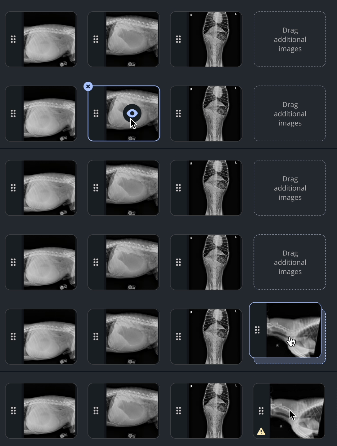
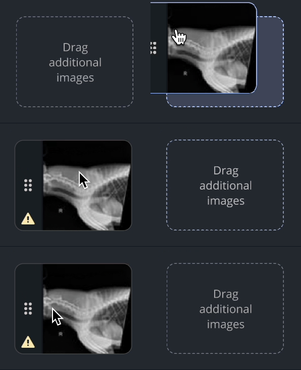
In order for more accessible touch targets, the placement of the icons shifted. The thumbnail container was extended to include a band for the drag handle. We also utilized this band to display the warning icon (instead of placing it on top of the image).
The Remove (“x”) icon was relocated to the top left corner, breaking out of the thumbnail container. This icon only appeared on hover.
The Preview (eyeball) icon increased in size and was anchored on a grey-black circle, which alleviated any contrast issues. This icon displayed on hover (as did a border outline color), indicating to the user that the image is interactive.
The overall style of the image container was also updated with softer corners for a modernized look.
Solution 2 — Visual Feedback
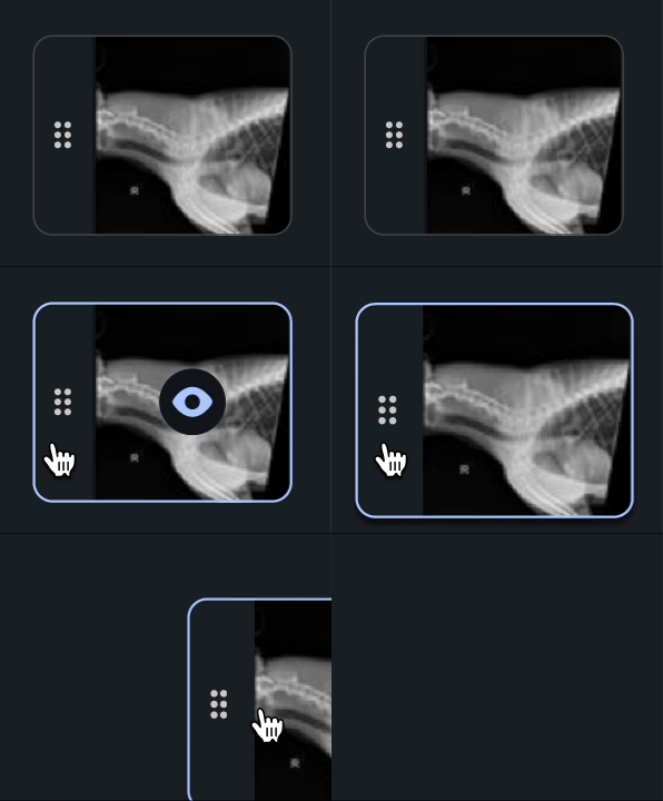
We created a fluid interface and eased users’ interactions with specific objects on this page with the following enhancements:
Border color on hover state signals to the user they have targeted a specific image and can interact with it.
Subtle color change to all icons on hover (excluding drag handles)
Upon pressing and holding, the image thumbnail increases in size and adds a subtle drop shadow. The size increase combined with the subtle elevation change communicates to the user that they have successfully grabbed an image and can move it.
When an image crosses over the border of the drop target, the drop target changes color. This state transition communicates to the user they have entered the targeted area and can successfully drop the object.
Solution 3 — Clear Error Messaging
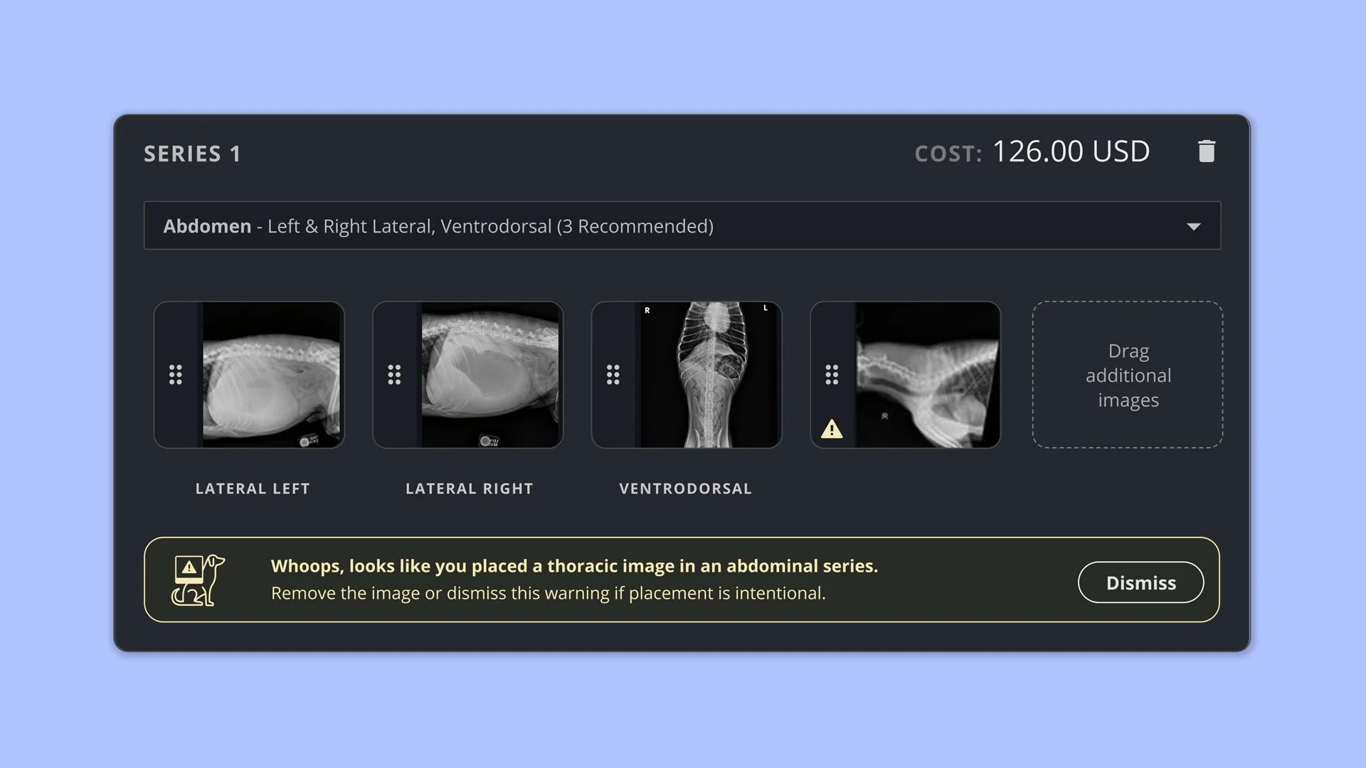
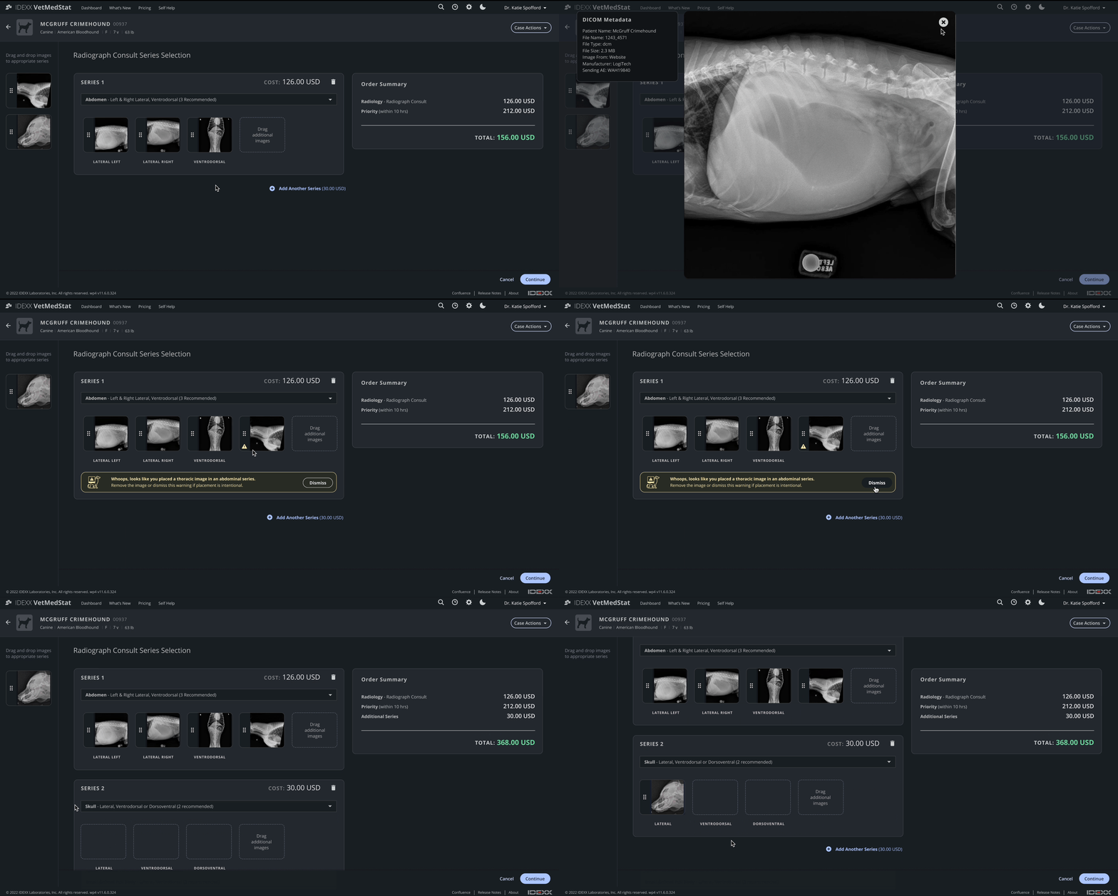
Messaging was updated to clear, actionable language that allows users to move beyond the error by clicking a “Dismiss” button. The language was also softened to feel less accusatory and more approachable.
Supplemental graphics were added to provide clarity and to develop a visual association with a specific error message.
The secondary modal was completely removed.
Whoops, looks like you placed a thoracic image in an abdominal series. Remove the image or dismiss this warning if placement is intentional.

Hmm, that’s more than the recommended number of images. Remove the extra images or dismiss this warning if extra images are intentional.
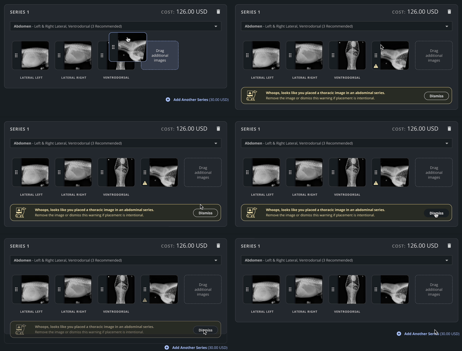
Full screen view of Figma prototype
UX Research Analysis of Impact
35% reduction in session abandonment
40% decrease in user frustrated signals
Overall improved user confidence, based on qualitative feedback from user testing.
Conclusion & Learnings
Small changes in icon placement significantly improved usability.
Real-time feedback enhances user confidence in interactions.
Error messages should guide users, not block them.
Testing with real users provided invaluable insights that shaped our final design decisions
To make this redesign even more impactful, the machine learning model should be expanded and retrained ;)