

01
Diagnostic Case Reports
Overview
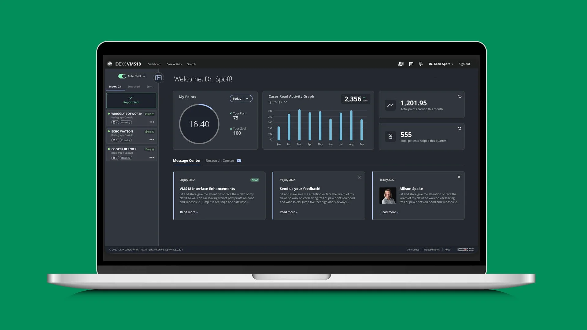
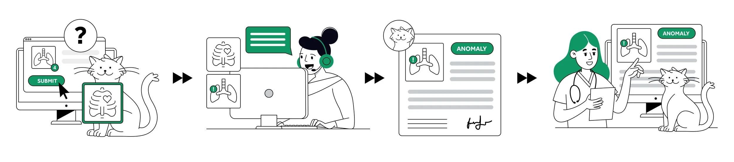
VMSPro is an internal platform used by IDEXX’s radiology, cardiology, and specialty teams to review diagnostic cases and dictate imaging interpretations—work that directly impacts patient care and business performance.
As part of a broader modernization effort, the team was integrating PowerScribe, a third-party dictation tool that demanded significantly more screen space. At the same time, engineering was re-platforming VMSPro to a modern React stack. This shift in tooling along with the conversion to React gave us the opportunity to rethink the VMSPro experience.
Our role as UX designers was to:
Identify opportunities to reduce friction and improve clarity
Facilitate user research
Modernize the UI using the latest design system
Make VMSPro fully responsive across varied screen setups
The work demanded deep collaboration with medical leadership, specialists, engineering, and product stakeholders—anchored in research, feasibility, and shared goals.
Team
2 Designers
1 Product Manager
2 Sr. Software Engineers
4 Radiologists
1 Business Analyst
1 Product Owner
Framing the Challenge
VMSPro was never designed with responsive use in mind. With the introduction of PowerScribe into the workflow—forcing specialists to split a single monitor between two mission-critical tools—VMSPro’s interface began to show its limits. Overlapping content, buried actions, and unpredictable layouts created friction that could slow down reads and increase cognitive load in an already high-focus environment. Specialists spend nearly their entire workday in VMSPro. Even minor inefficiencies could significantly affect their productivity.
What made this redesign especially complex:
VMSPro needed to be fully responsive and performant
The experience had to work seamlessly alongside PowerScribe
Changes had to respect clinical accuracy and preserve mental models
The UI needed to feel modern—without being disruptive
This project was more than a visual refresh. It was a deep, foundational rethink of layout, hierarchy, and interaction in a highly specialized domain—delivered without compromising clinical accuracy, specialist focus, or productivity.
Typical specialist workstation setup
Business & User Alignment
From the outset, it was clear that business priorities and user needs were closely aligned—both aiming to increase efficiency, though framed through different lenses.
Business Goal: Boost specialist throughput by implementing a more performant tech stack and enhanced case read workflows
User Goal: Complete more case reads with less friction, fatigue, and frustration
By identifying where business goals and user goals naturally overlapped, we could prioritize features with the greatest impact, guide design decisions, and communicate tradeoffs more effectively with stakeholders. To ensure our design solutions addressed both perspectives, we grounded our approach in three shared priorities:
Optimize for efficiency
Support responsive, reliable use
Enhance visual clarity & engagement
Research + Discovery
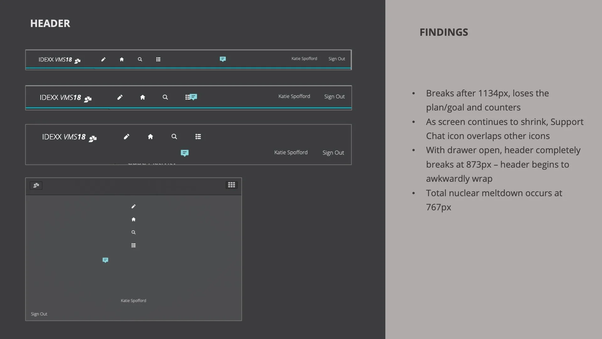
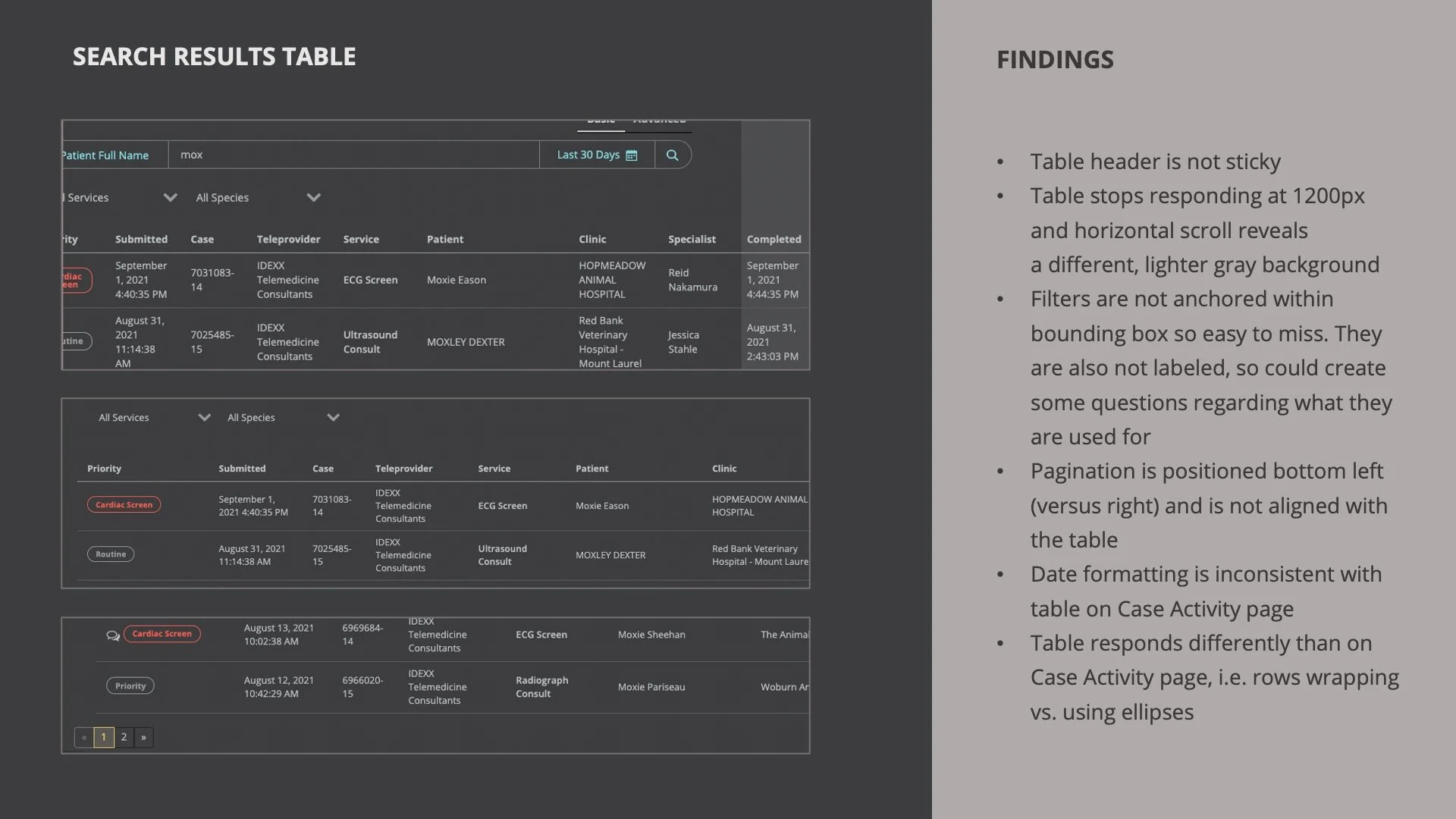
The first step in this responsive design lift was auditing the current VMSPro application with my design partner. Over several working sessions, we dug into responsiveness (or lack thereof), interactive states, page behavior, and consistency from screen to screen. We documented and shared where the app was breaking, where it deviated from the design system, clunky behaviors, and other inconsistencies. Once our audit was complete, we reviewed our findings with product and engineering.
We then sat down and interviewed specialists to learn more about their workflow and current pain points. We were also invited to observe some of the specialists as they read through a case, which helped us understand their process and identify friction points. Each specialist we spoke to emphasized the need for efficiency — they want to maximize the number of cases they read a day because it equates to patients helped and monetary earnings. We also learned:
• Specialists spend 7-8 hours a day in VMSPro
• The average case read takes 8 to 12 mins per case, depending on complexity
• 90% of their time is spent on the case report screen
• Most work in ambient lighting
• Most described the application as functional but “boring”
• Most use VMSPro and PowerScribe on one monitor, with additional monitors for image viewing
“VMSPro right now as it is is functional, but it’s kinda plain, so it would be nice to make it more interesting to look at. Considering how much time I spend in my work week looking at this program, making it more visually appealing would be a good thing.”
The overwhelming emphasis on efficiency and the fact that specialists spent the vast majority of their time on the case report screen clearly identified this flow as the area with the greatest potential for impact. Understanding their needs through workflow mapping across VMSPro and PowerScribe allowed us to directly align our design goals with key business objectives, as outlined below.
Key Problems Identified
The research and our aligned goals highlighted key areas where VMSPro was falling short. The specialists' need for efficiency and the business's desire for improved performance were directly hampered by issues such as a flat and unengaging interface, poor content hierarchy on critical screens (especially the heavily used case report screen), and clunky, non-responsive layouts. These core issues formed the basis of the problems we aimed to solve:
Problem 1 — Flat and unengaging interface
Specialists described the UI as static, uninspiring, and at times, broken—especially the dashboard. While the app allowed them to complete their tasks, it lacked any meaningful interactivity or visual polish. Given that specialists spend 7–8 hours a day in this tool, the lack of aesthetic appeal contributed to fatigue and reduced focus.
Problem 2 — Poor content hierarchy on critical screens
The case report screen—the most frequently used view—was text-heavy and lacked visual structure. Clinic details, medical history, and presenting complaints all blended together. Without a clear hierarchy or delineation, users often lost their place while toggling between VMSPro and PowerScribe during dictation, slowing down their workflow.
Problem 3 — Clunky, non-responsive layouts
At smaller resolutions, the app was nearly unusable. Content overlapped, actions were buried beneath excessive scrolling, and there was little feedback when interacting with components. Layouts did not adapt intuitively, deviating from expected mental models and adding friction to an already intensive task flow.
Design Process + Stakeholder Collaboration
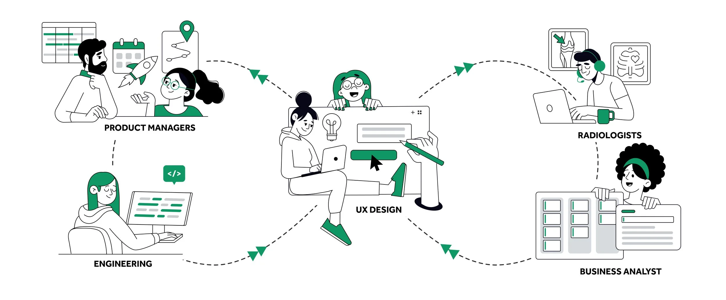
The design phase was a highly collaborative process involving both iterative user testing and close alignment with cross-functional stakeholders. For each high-priority screen, my design partner and I would work independently, then compare and combine our strongest ideas into a unified direction. We regularly reviewed our designs with engineers, the product team, and medical leadership to ensure feasibility, alignment with requirements, and clinical appropriateness.
We gathered feedback from our radiology and cardiology consultants through one-on-one interviews and small focus groups. This feedback was critical in refining flows, reducing friction, and prioritizing content.
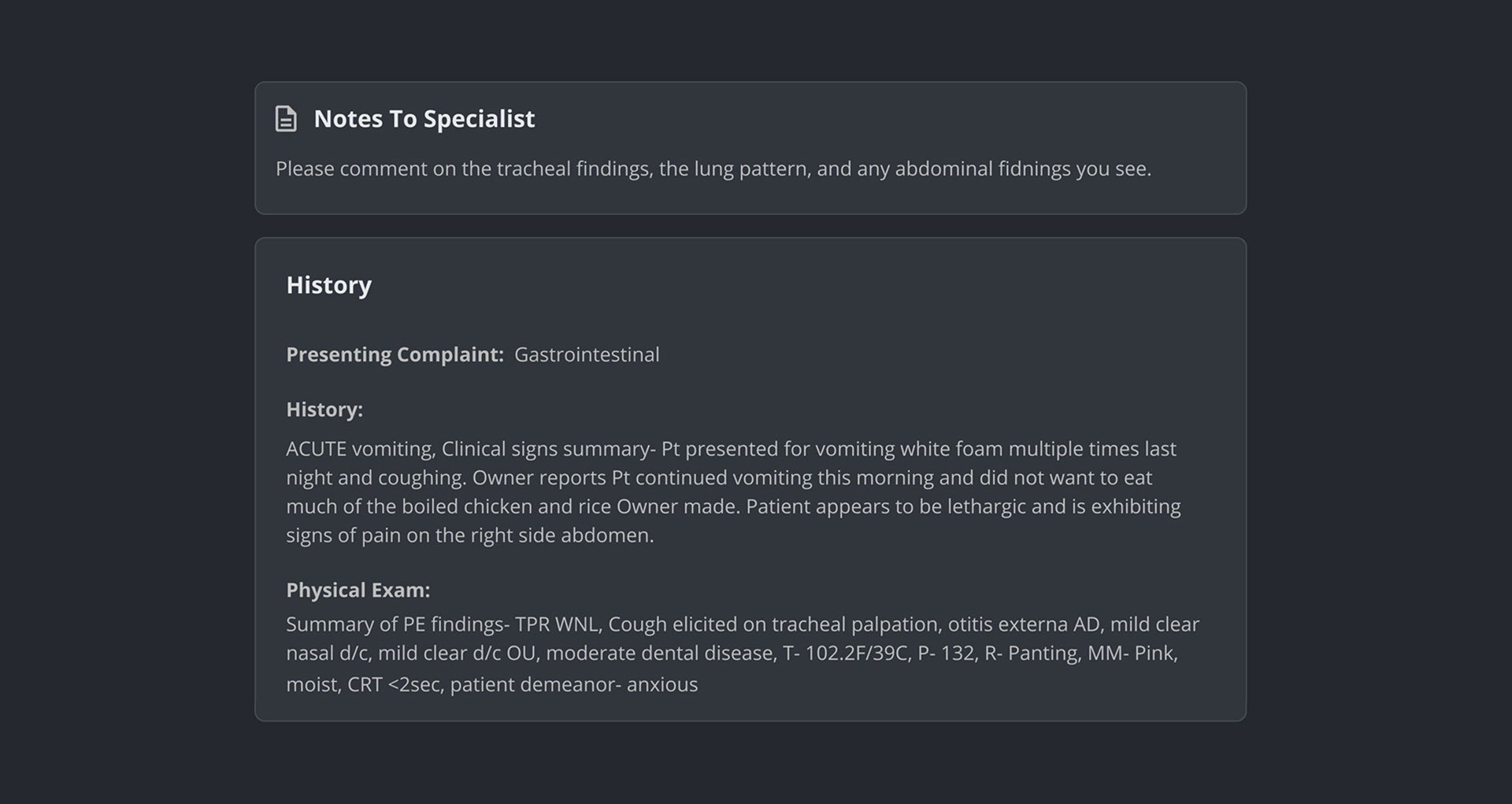
Stakeholder feedback also directly shaped key design decisions. For example, during a design review, the medical leadership team noted that Notes to Specialist was often being overlooked because it visually blended into the surrounding case report content. These notes frequently contain important patient context and are essential for a complete read. In response to this feedback:
We broke Notes to Specialist out into its own distinct content block.
We repositioned it to the top of the case report screen, ensuring it was one of the first things a specialist would see.
This change improved visibility and helped specialists more easily identify critical case information upfront.
Solutions
To address the key usability challenges—visual disengagement, poor content hierarchy, and responsiveness—we delivered targeted UX/UI solutions that improved interaction quality, layout clarity, and overall efficiency. After finalizing the designs, we presented to the three medical leadership teams—Business, Commercial, and Marketing. Our presentation covered VMSPro’s current state, research findings, and UX/UI issues screen by screen, incorporating specialist feedback. We then walked through a case report flow, demonstrating how our design solutions addressed key problem areas.
Solution 1 — Dynamic, Delightful, and Designed for Humans
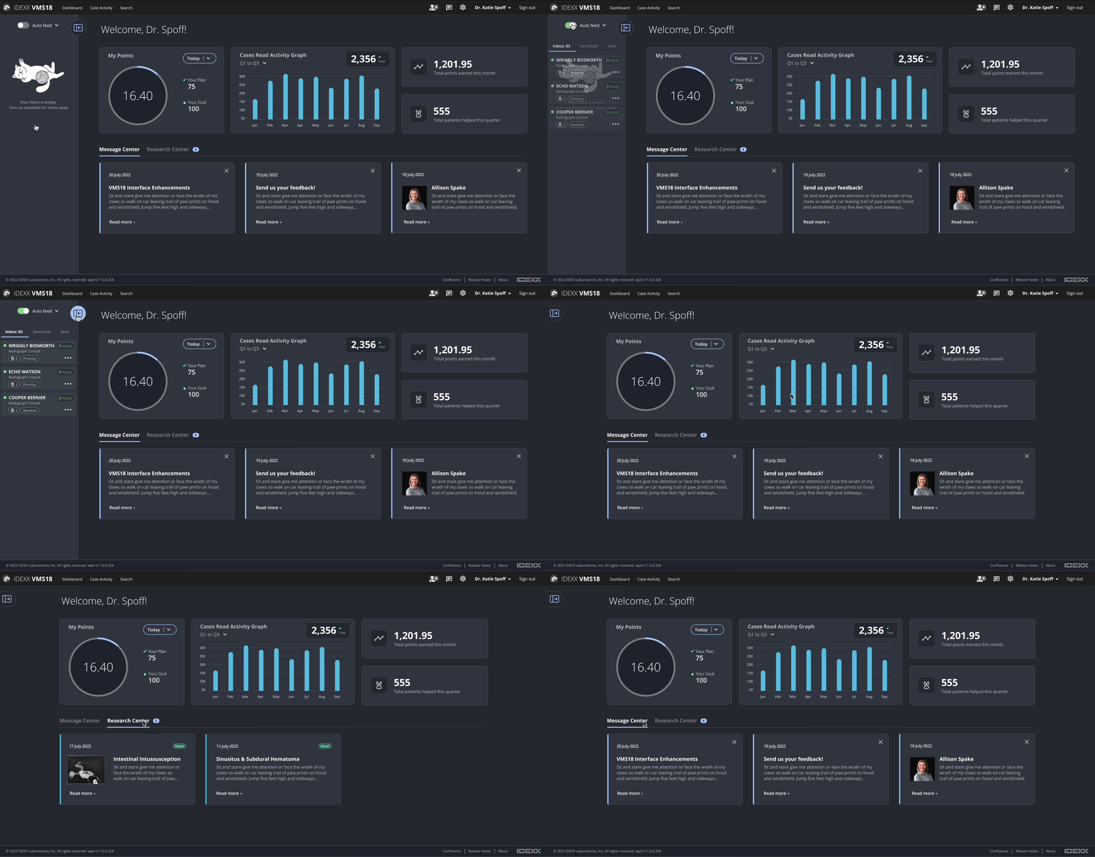
To bring life back to the platform and make daily use more enjoyable for specialists:
• Transitioned the application to the latest version of the design system.
• Designed a more dynamic, interactive, and visually balanced interface that feels intuitive and polished.
• Introduced subtle, purposeful animations (hover effects, button states, loading indicators) to improve feedback and responsiveness.
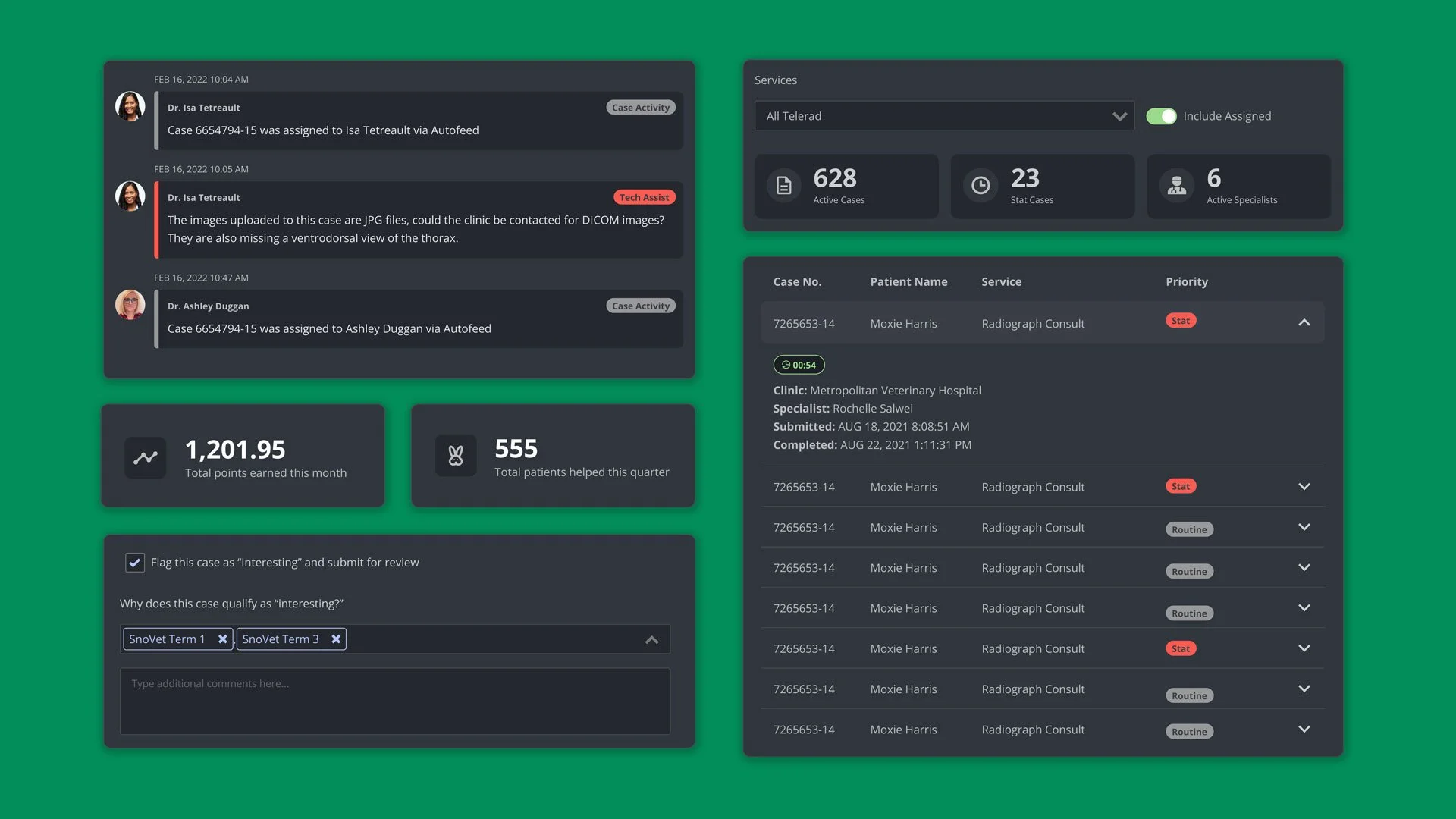
• Designed visually engaging dashboard widgets and animated charts to add movement and energy without distraction.
• Introduced delighters, such as playful empty state illustrations and “total patients helped” counter
Solution 2 — Built for Clarity, Tuned for Throughput
To help specialists stay oriented during complex reads:
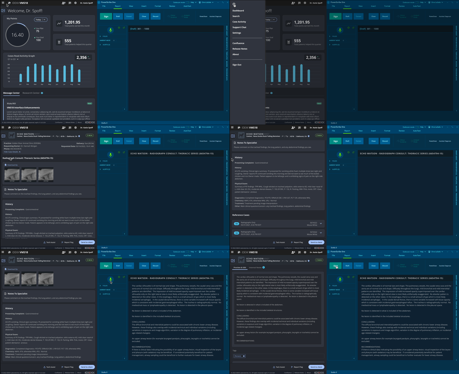
• Structured the case report screen into distinct, visually defined blocks
• Prioritized “stat” cases to the top of the specialist inbox
• Surfaced the case read turnaround time
• Used larger headings, consistent spacing, and visual dividers to create structure
• Made critical data (like patient details, case ID) sticky—so it remains visible while scrolling
• Tucked secondary content within expandable/collapsible section, reducing cognitive load and enabling focus on key details
Case read, full screen view
Solution 3 — Responsive by design
To reduce friction and align better with mental models:
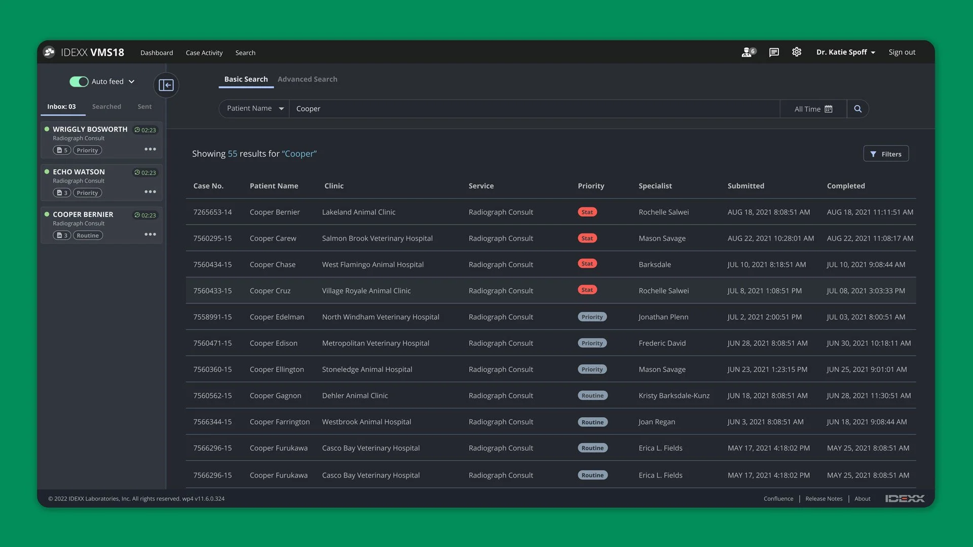
• Implemented a flexible grid that adjusts dynamically to different screen sizes, ensuring content doesn’t overlap or break.
• Introduced responsive UI elements (e.g., collapsible data tables, dynamically resizing cards) to maintain usability across devices.
• Enabled collapsible side panels for tools like navigation or filters, reclaiming valuable real estate when needed.
• Introduced a responsive mobile menu at smaller screen sizes to keep navigation accessible without clutter.on.
• Repositioned action buttons and key controls to reduce scrolling and streamline task completion.
Outcomes + Impact
To assess the effectiveness of the redesign (with the help of UXR), we gathered feedback from specialists and observed real-world usage post-launch. While some of the following metrics are based on estimated averages, drawn from user feedback and internal insights, they represent the significant improvements made in efficiency, satisfaction, and usability.
Time Saved per Case Read
→ 2–3 minutes saved per case, thereby increasing throughputIncrease in Cases Read per Day
→ +4 additional cases per specialist/day, thereby increasing throughputBoost in User Satisfaction (Qualitative/Survey)
→ 82% of users reported increased satisfaction, reflecting a strong improvement in perceived usability and overall experienceResponsive Layout Success Rate
→ 100% usability across all tested screen sizes, leading to consistent, efficient workflows regardless of device or screen resolution
By addressing core issues around responsiveness, hierarchy, and interactivity, we delivered a tool that now better aligns with the high standards and fast pace of specialist workflows. These measurable improvements reinforced the importance of human-centered design and validated the collaborative, research-driven process we followed.
Specialist feedback
Following the launch of the redesigned VMSPro platform, we gathered feedback from specialists through interviews and focus groups. Their responses were largely positive, emphasizing both practical improvements and enhanced usability. Below are key highlights that reflect how the redesign addressed their main pain points.
“I can tell you have all been working in harmony on this project. The way the app resizes and re-organizes itself at different screen sizes is very thoughtful and makes sense to me. You can see this behavior wasn't just thrown in as an afterthought! It might sound corny to say its beautiful, but I do think it looks amazing!”
“Everything is more logical and less mouse movement for me – which is something to consider as far as like fatigue at the end of your shift – you know if you’ve been reading cases for 7 hours, it gets tiresome to do some of these repetitive tasks, so making it less movement is helpful.”
“I love the call out of the points earned versus patients helped – it’s cool to see it separated out. It’s a fun way to remind us that we are helping animals at the end of the day… there’s a patient attached to that [work].”
Reflections + Lessons Learned
As designers, while the VMSPro redesign led to significant improvements in efficiency, usability, and user satisfaction, there are always opportunities to learn and grow. Reflecting on the project, there is one area where we could have taken additional steps to further optimize the outcome:
Data-Driven Metrics
While we relied on estimated averages to measure the impact, integrating real-time analytics and tracking specific user metrics—such as time spent on key tasks and navigation patterns—could have provided more granular insights into the impact of the redesign. This data-driven approach would have further validated the success of our solutions and highlighted areas that could benefit from additional refinement.
By reflecting on these points, we can refine our approach to future projects, ensuring we incorporate these lessons into our design process and continue delivering even more user-centered, efficient solutions.