02
Reimagining Diagnostic Results
Overview
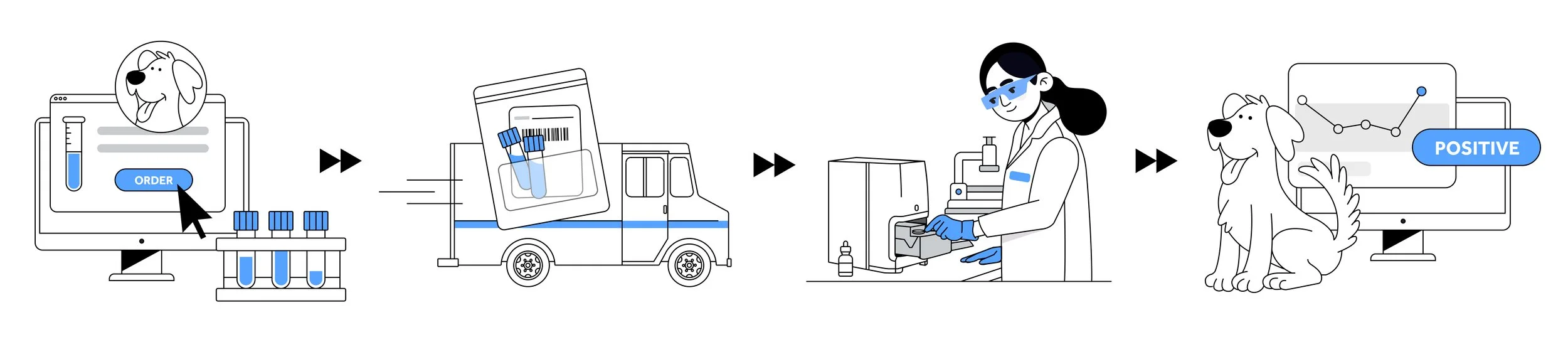
IDEXX’s VetConnect PLUS is a diagnostic platform designed for veterinary professionals. It allows clinicians to order, track, and review diagnostic test results from IDEXX’s in-house and reference lab services. It essentially helps veterinarians make faster, data-driven decisions and improves patient care by ensuring quick and easy access to diagnostic information.
My Role
Design + Research Synthesizer
Project Type
Vision project
Status
In progress, currently moving into user research
Challenge
Leverage historical research to drive a comprehensive redesign that creates a streamlined, future-proof experience—one that adapts to evolving workflows, supports mobile parity, and lays the foundation for localization and growth.
Research Deck Graveyard
We recently launched an order tracking feature to give our customers clear visibility into an order’s progress. However, post-launch research revealed that many users found it cluttered and cumbersome, especially when managing high order volumes. While there were quick fixes available, the issue was deprioritized, leaving clear customer concerns unaddressed. This made me wonder: what other valuable user feedback might have been overlooked? With the help of UX Research, I explored our vast research deck graveyard and uncovered a recurring theme:
Time is a clinician’s most precious commodity.
Every extra minute spent searching for information, struggling with software, or picking up the phone to call customer support isn’t just time taken from patient care—it’s time stolen from their lunch break, from much-needed moments of rest, and from their families at the end of an already exhausting day.
It became clear we were missing a huge opportunity: the home screen—one of the most visible and frequently visited parts of the experience—was cluttered, non-actionable, and not designed to support clinicians in the moments that matter most. We had the potential to turn it into something far more powerful: a streamlined, intuitive tool that helps clinicians do their jobs better and faster.
UI post-launch of status tracker
Translating Research into Actionable Insights
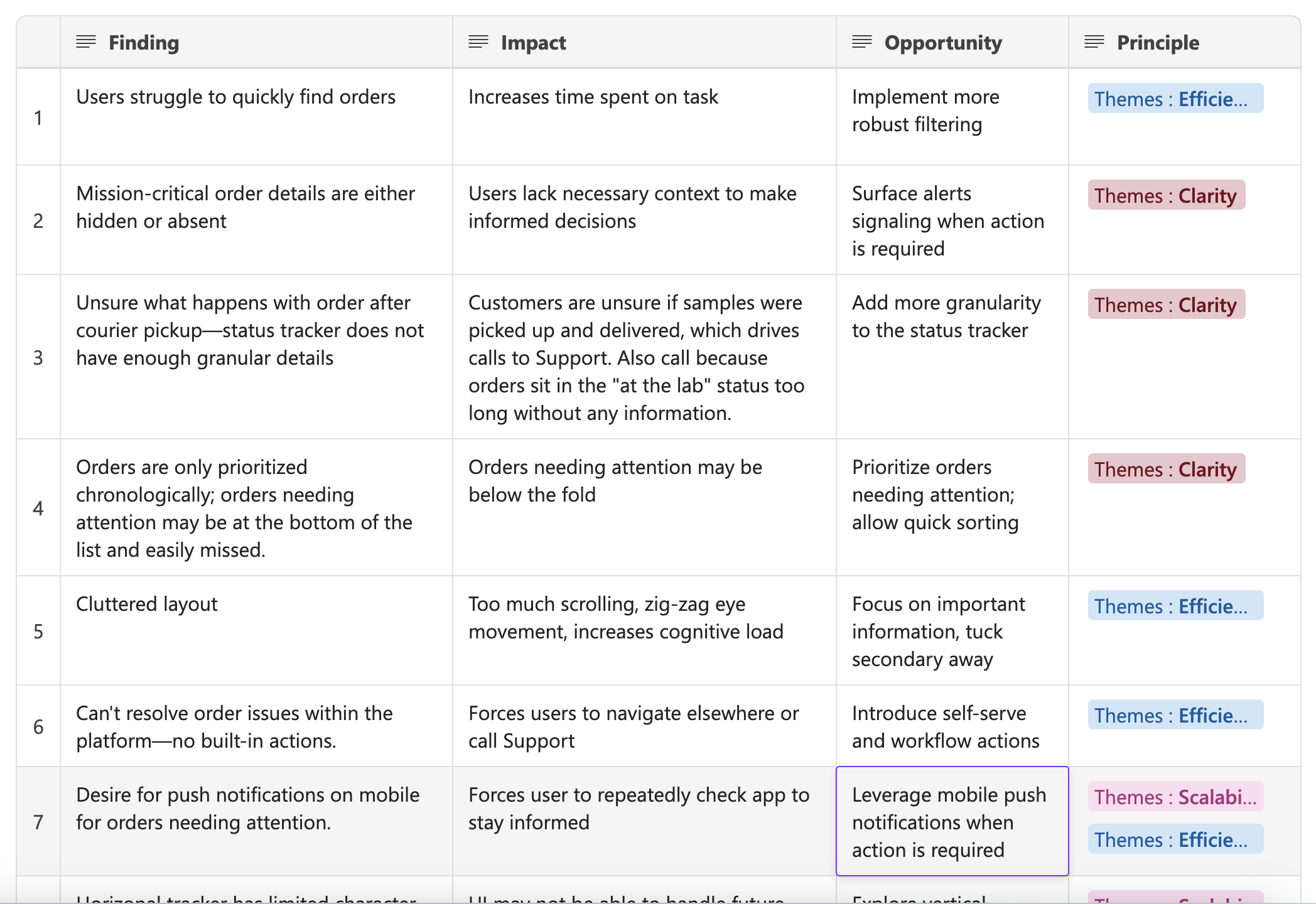
Recognizing this opportunity was only the first step. To turn these scattered insights into meaningful improvements, I needed a structured way to make sense of it all. I began documenting the findings, the impact as well as the opportunity, and employing thematic analysis, I began to distill the research into core themes.
A crucial part of this process was collaboration with fellow product area designers. Their diverse perspectives were invaluable in ensuring a comprehensive understanding of the user experience, and we were able to more accurately identify and interpret usability issues, assess their impact on both users and business goals from multiple angles, and generate a wider range of insightful improvement opportunities.
Key themes identified:
These themes provided a clear framework for understanding the core pain points and guided the subsequent design solutions.

Theme 1: Lack of Clarity
Insight: Users struggle to quickly scan and prioritize critical information due to unclear visual hierarchy.
User Goal: Easily understand information at a glance.

Theme 2: Inefficient Workflows
Insight: Excessive scrolling, poor filtering, lack of automation, and disruptive navigation slow down user workflows.
User Goal: Quickly find relevant content and access key actions without unnecessary steps.

Theme 3: Limited Scalability
Insight: The rigid design limits responsiveness, localization, and future growth.
User goal: Seamlessly use the app across various screen sizes and support an expanding set of user actions.
Business Alignment
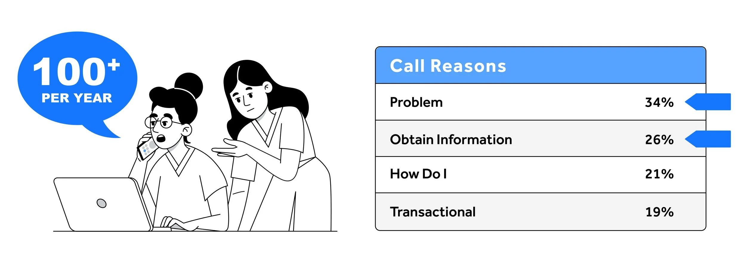
To support the corporate goal of improving the overall customer experience, we leveraged data provided by our company's customer support organization. This data reveals a significant area for improvement: the average customer contacts support over 100 times a year, with each call lasting around 10 minutes. We hypothesize the lack of clarity and inefficient workflows within VC+ directly impact the top call-drivers—“problem” and “obtain information.” As we learned through our own research, users often struggle to understand order status and frequently reference “sample issue resolution” as their top reason for contacting support. As one user put it, “There must be a more efficient way to do that.” By addressing these pain points, which our thematic analysis has validated, we can directly support our corporate goal of enhancing the customer experience—while also reducing support volume, improving user satisfaction, and boosting operational efficiency.
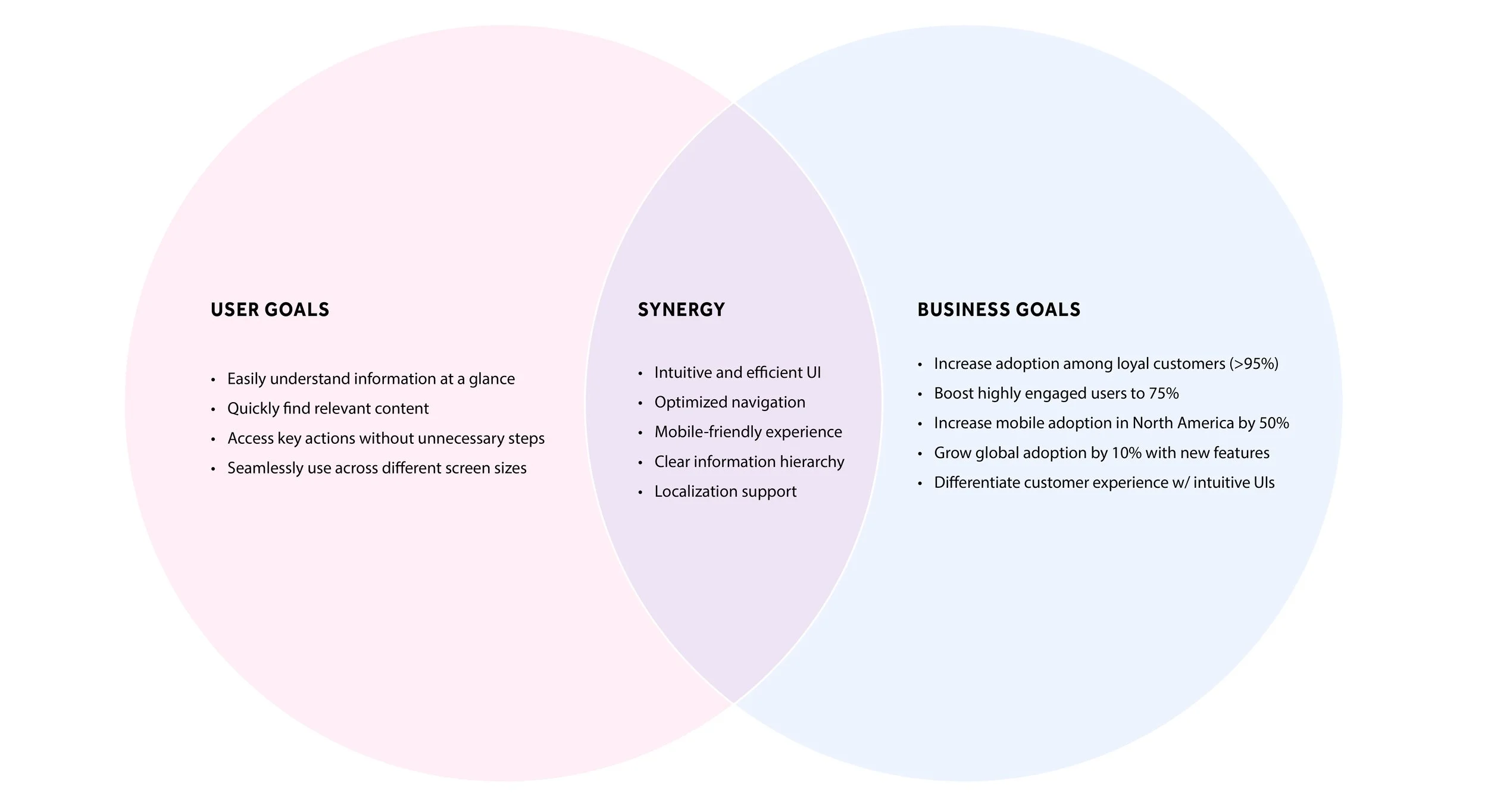
And lastly, to ensure alignment with VetConnect PLUS business objectives, I used a Venn diagram to identify overlaps between user and business goals. These overlaps helped refine the problem statement and inform our design decisions.
Problem Statement
The VetConnect PLUS home screen lacks clear visual hierarchy and streamlined workflows, making it difficult for users to efficiently locate and act on critical information. This inefficiency leads to increased reliance on customer support for tasks that should be intuitive and self-serviceable, lowering user satisfaction. Additionally, the rigid layout limits adaptability across devices, hinders localization, and constrains future scalability—posing risks to long-term product growth, global expansion, and our ability to meet evolving customer needs.
Design Approach
To begin, we created a high-level journey map, visually outlining how a clinician feels throughout their workflow and pinpointing key areas for improvement. This map served as a foundational tool, revealing opportunities where a redesign could have the most significant impact.
We then conducted a screen audit and an affinity mapping session, which allowed us to synthesize our research findings, brainstorm solutions, and identify the user tasks that needed to be prioritized in the redesign of the homescreen.
User Tasks
Initiate a new order or request
Obtain information about an order
Know when diagnostic samples have been have been picked up and delivered to lab
Monitor status of diagnostic result
Quickly navigate to pending or active orders (usually to give a doctor or pet owner an update)
Address critical lab alerts
Add to/Edit/Cancel an order
Schedule a medical consult from the completed result
Resolve order issues flagged by the lab
Assign completed results to a doctor
Flag high priority orders (for very sick patients)
Automate sharing of negative results to pet owners
Complete a workflow and remove the order from the homescreen
With a solid understanding of the problem space, we transitioned into the design phase. Throughout this process, we maintained a strong focus on key themes and measurable outcomes, ensuring our design decisions were aligned with both user needs and business objectives:

Decrease time on task

Reduce calls to Customer Support

Boost user engagement

Improve customer satisfaction
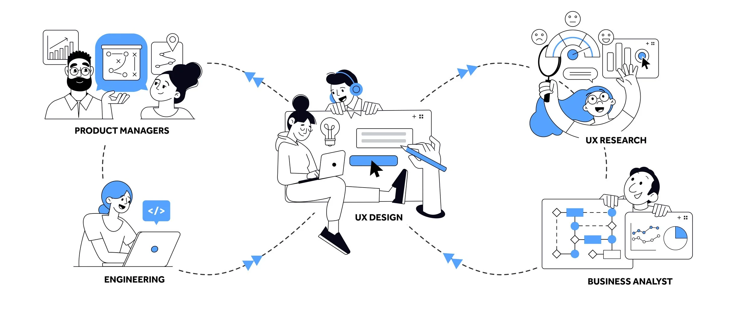
Through consistent collaboration and multiple design iterations, we refined our solutions, ensuring each element contributed to a cohesive and user-centered experience. We established regular feedback loops with key stakeholders—including product managers, engineers, UX researchers, and business analysts—which enabled us to validate ideas early and often, align priorities across disciplines, and incorporate diverse perspectives into our solutions. This iterative, cross-functional approach culminated in a well-defined strategy, grounded in a thorough understanding of the clinician's workflow.
Sample of design iterations:
Closely aligned with current experience
Largest departure from current experience
Design Vision
Inform at a glance, explore with ease, act with confidence.
After several rounds of collaboration and feedback sessions between us designers, we were ready to showcase our vision. The solution we landed on ultimately solves a lot of problems without completely revolutionizing the UI in a way that would overwhelm the user—there are still some visual threads that tie where we are today to where we want to go.
Theme 1: Clarity
Easily understand information at a glance
Visual Hierarchy: Improved layout to support better scanning, reduce clutter, and help users focus on what matters.
Prioritization Cues: Visually distinguished orders that require action or contain abnormal results for immediate recognition.
Progressive Disclosure: Enabled users to click into specific areas—such as an order’s status history or lab comments—for deeper insights, without overwhelming the default view.
Redesign focused on prioritization and scannability
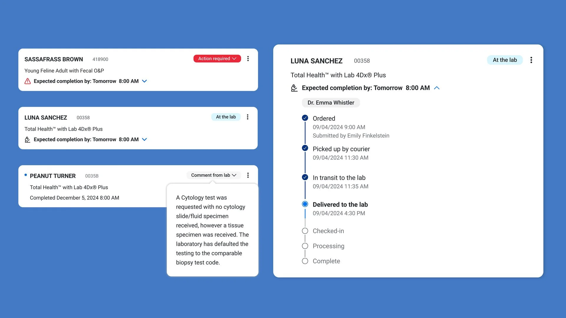
Enhanced order component
Theme 2: Efficiency
Quickly find relevant content and access key actions without unnecessary steps
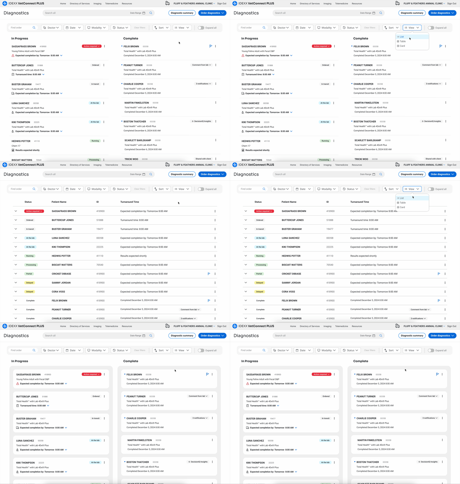
Filtering: Enabled robust filters for quick order retrieval.
Actionability: Integrated key actions directly into the order list for immediate access.
Self-Service: Introduced self-service options to allow users to resolve orders issues independently.
Automation: Automated result sharing with pet owners or doctors to save time and reduce manual tasks.
Optimization: Improved layout for quicker scanning and reduced scrolling.
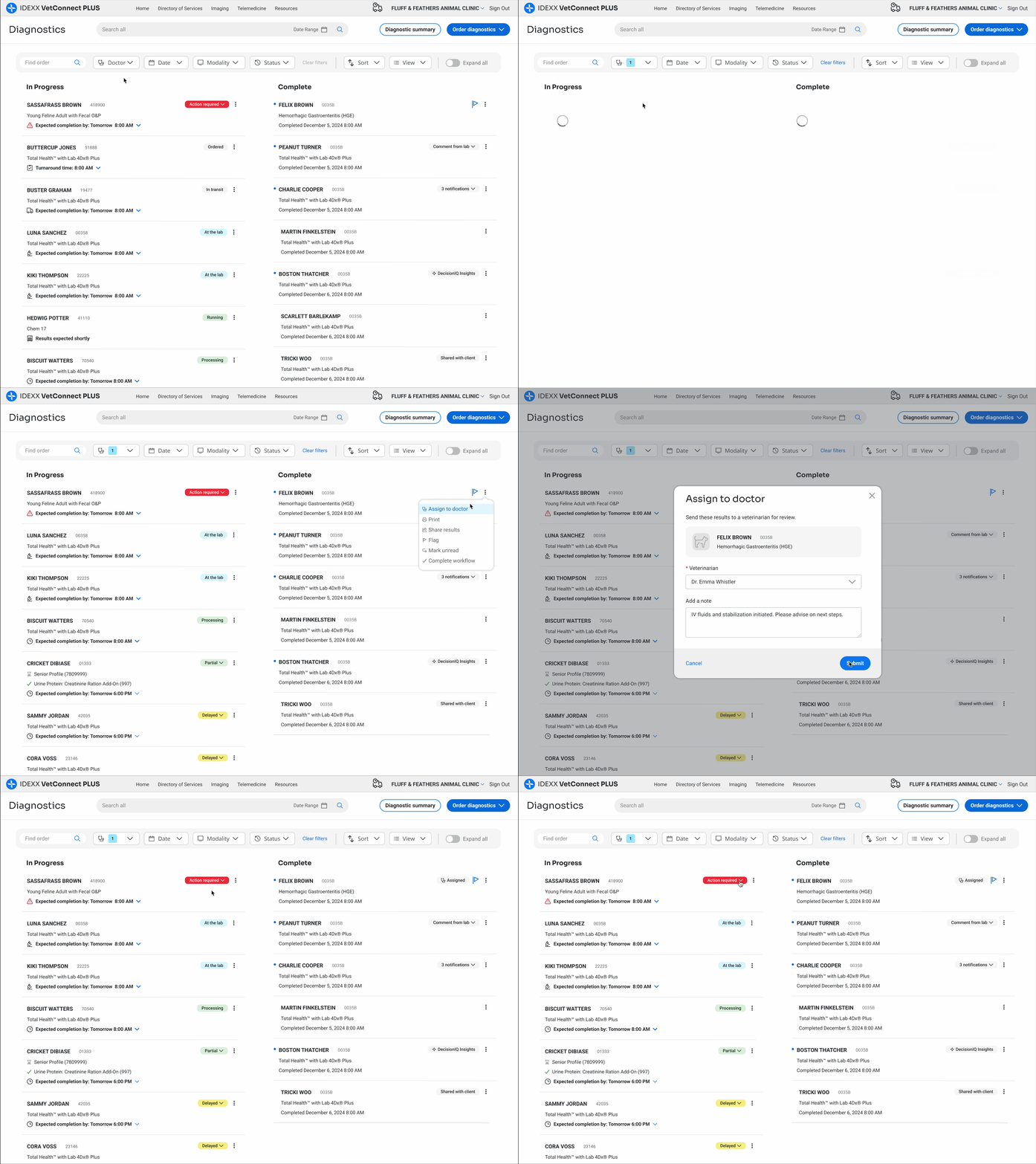
Prioritization: Implemented intelligent routing to automatically flag orders requiring action or containing abnormal results, surfacing them at the top of the dashboard and visually distinguishing them for quicker recognition and follow-up.
Prioritization and self-service
Automation and actionability
Theme 3: Scalability
Seamlessly use the app across devices, regions, and future enhancements.
Adaptability: Improved vertical tracker for mobile parity and localization.
Flexibility: Designed overflow menu to accommodate growing actions and workflows.
Expansion: Enabled scalable content without compromising usability.
Ecosystem: Standardized components and patterns to support orders across Reference Labs and in-house diagnostic equipment.
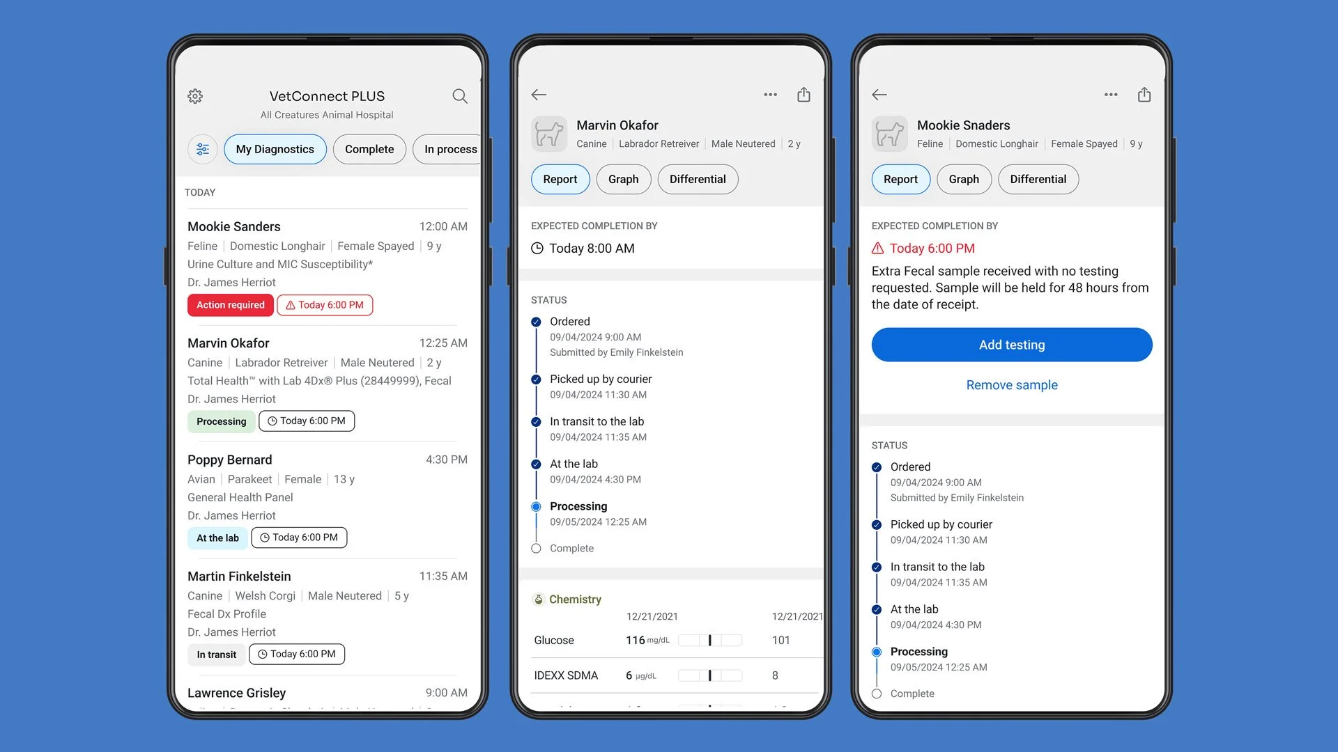
Mobile designs
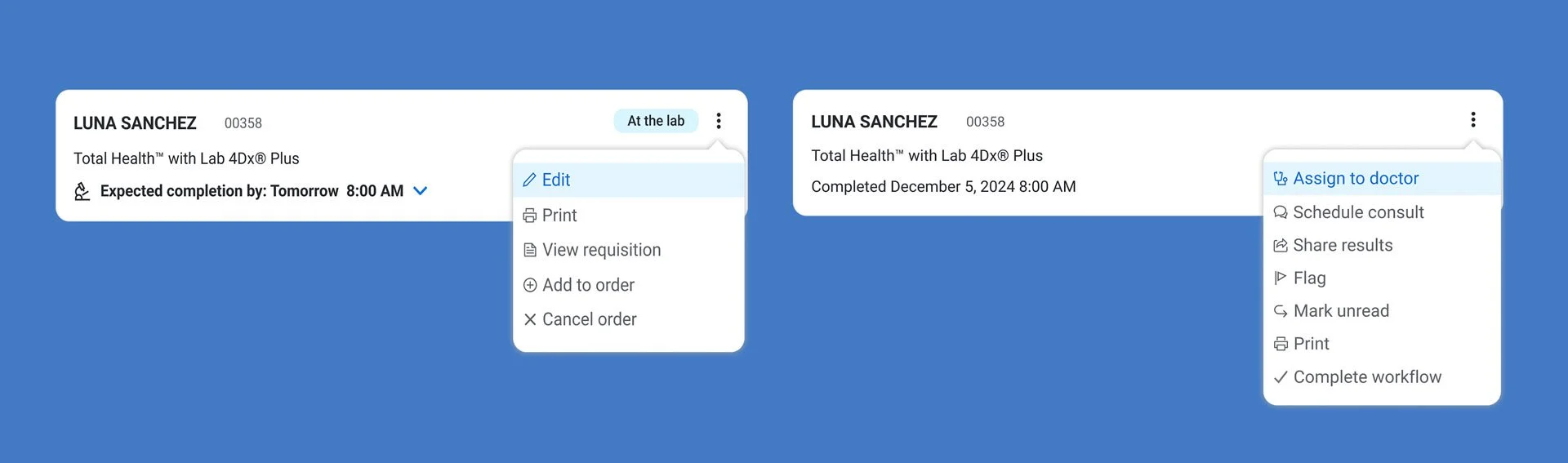
Action menus for processing and completed orders

Resources menu
Localized tracker and in-house diagnostic alert
Stakeholder Feedback
After several rounds of iteration and close collaboration with product managers, engineers, and business analysts, we arrived at a refined design vision. We then presented this vision to leadership, highlighting key workflows and implementation-ready solutions.
Leadership’s feedback focused on refining specific workflows, such as scheduling a medical consult or allowing users to add to orders, and they encouraged us to explore opportunities for greater customization. Their strong support for the direction was reinforced by a request to partner with our UX research team to validate the experience with users and guide future iterations.
Components: Schedule medical consult, courier widget, enhanced completed order
Next Steps
The next phase involves working with our UX Research partners to scope methodologies and research efforts. This research will help ensure that the redesign truly solves the original issues and uncovers any remaining gaps before moving into development.
Specific Research Goals:
Validate the identified pain points
Assess the usability and effectiveness of the proposed design solutions
Identify any remaining gaps or unmet needs
Gain a deeper understanding of how users interact with the platform in their daily routines
Gather feedback on specific elements.
Measure potential impact (i.e. task completion speed, self-service usability, user engagement, and mobile adoption)
Inform further design iterations
Validate stakeholder feedback
In essence, the upcoming UX research aims to de-risk the redesign by ensuring it is truly user-centered and will deliver the intended improvements in efficiency, clarity, and scalability for veterinary professionals.
Meanwhile, development is already underway on some aspects of the redesign. The vertical status tracker is currently in development for the mobile application and is expected to launch before the end of Q2. Two additional low-risk elements—the updated filters and the relocation of the side panel to a dedicated “Resources” link—are slated for release in Q3. These phased releases help maintain delivery momentum while we continue to validate and refine the broader experience.
Reflections

Data alone doesn’t inspire action—compelling stories do.
We can meticulously compile, sort, and present every data point, but to truly engage our stakeholders, it’s best to paint a picture of the 'what could be,' not just the 'what is.' By showcasing a compelling vision—deeply rooted in user insights and cross-functional feedback—we transform passive observers into active participants, sharing in the excitement and belief that a better outcome is not only possible, but within reach.
As we move into user research, I’m excited to validate our solutions, refine the experience, and, ultimately, deliver a platform that will make a real difference for our users, enabling them to focus on what truly matters—providing the best possible care for their patients.